
Technology in construction planning
I wrote a post on this blog a while ago about analytics in design & construction. The gist was the use of technology to identify construction risks and opportunities.
In a construction project, program is the single most important factor in profitability. A combination of astronomical daily project costs such as people, plant & equipment, plus penalties (such as liquidated damages) or incentives can mean each day is worth hundreds of thousands or even millions of dollars. If you don’t get the program right, then forget making any money.
After all, some project costs such as materials are pretty well fixed- a cubic metre of concrete normally costs the same on a Tuesday or a Wednesday. One construction company can only differentiate themselves from the next by executing work faster or more efficiently.
Furthermore, a delay in one part of the work can have a massive knock-on effect to others, and a small problem can get amplified by these dependencies.
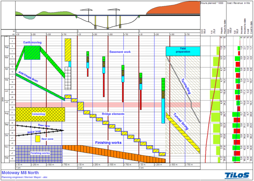
Despite this, the tools used for planning, analysing & communicating a complex program are surprisingly basic. Nearly all projects will have a program in the form of a gantt chart, or if it is a linear project perhaps a time chainage diagram. Out of the program, other outputs such as histograms or graphs might be produced, or analysis such as Monte-Carlo (essentially probability distribution), PERT or network logic diagrams.
In recent years, use of model-based ‘4D’ techniques have become more widespread- more on this later.
I am not alone in while I do understand gantt charts, and can follow the logic through of one activity starting after another has finished, it is difficult to get a sense of the ‘big picture’. In other words, what happens where and when.
Nice Wallpaper
In my experience, a project gantt chart (possibly consisting of tens of thousands of activities) can be used on the site office wall as a kind of decorative wallpaper, or used in a project report to give the impression that someone has it all worked out.
Generally the program is not widely understood.
It is virtually impossible to mentally reconstruct the program beyond a small time period or section of the overall program. It is fairly typical for individuals to take a small section of a program (such as a ‘3-week lookahead’) and independently develop it in an application such as Excel.

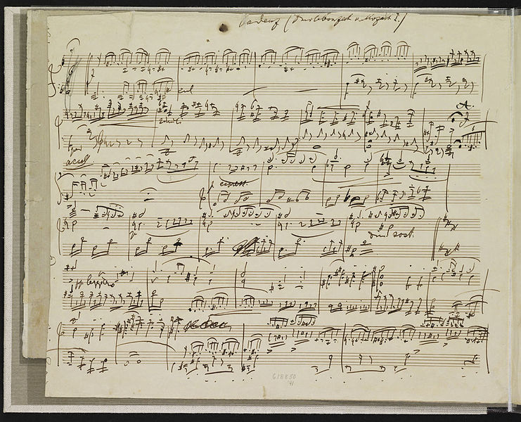
A musical analogy
I would liken a construction program in gantt chart format to an orchestral musical score: even for those who can read music, most would struggle to get a sense of the entire symphony. You’d need to hear it to fully understand it.
I imagine Mozart could hear the whole thing in his head before he put pen to paper, and just had to write it in this notation to communicate it to others.
4D for infrastructure
In many building projects, a ‘4D’ model will often be prepared by linking design models to the program. These can often have minimal value and the important issues get lost in the detail. A large part of these outputs can be bleedingly obvious. Of course, level 10 get built after level 9.
Furthermore, this technique does not translate well to large scale projects, such as linear infrastructure, where the physical size of model elements are minuscule compared to the overall project extent of many kilometres. The complex interplay of activities in time and space is better presented in a symbolic way, so that an activity is graphically represented, rather than to scale.
In the work-winning phase of a project, a hollywood-style construction animation is often prepared, with excavators digging dirt, cranes lifting thing and so on. Whilst these can be a useful communication tool, they are often more smoke & mirrors than a working tool, and involve a huge amount of effort just to produce a 1 or 2 minute movie. In addition, they are independent of the program- so if this changes, the whole thing has to be re-worked.
A better way ?
There has to be a better way of communicating and analysing a construction program using technology. This applies particularly to people who are not specialised planners.
As part of this, I have put together some samples showing my ideas for visualisation of a construction program for an imaginary project (Australian readers might recognise this as Lake George near Canberra. I’ve decided to build a road from nowhere to nowhere to illustrate my concepts)
These outputs supplement (not replace) other forms such as a gantt chart. They could help communicate, explain and analyse a construction program in terms of activities, time, space and cost.
The value is most of these formats is being able to interactively manipulate, rather than a movie that is ‘played’. For example, in this Google Earth file, it is possible to navigate to a particular place and then play/rewind the construction program to see what happens over time.
There are some possible problems in this program, such as activities moving in opposing directions than are readily identified.
This output is in the form of a week-week dashboard, showing the planned progress of activities and the cumulative cost:
This shows the cumulative cost as a heat map over the entire project:
This shows the activities over time as a heat map of activity density i.e identifies where the most work is happening at a point in time.
Technical notes
- These samples are (almost) 100% generated from the construction program- so if the program is changed, then these outputs can be refreshed with minimal effort.
- In technical terms, most programming applications are essentially a database, including activity date, position in space (chainage), cost, type etc. So outputs such as gantt charts or these outputs are just different representations of the same data.
- These sample are all data-driven i.e the graphics are generated by underlying data, not manually

You must be logged in to post a comment.